 digest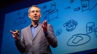
Some years ago I stumbled across a simple design exercise that helps people understand and solve complex problems. Like many of these design exercises, it seems trivial at first, but under deep inspection it turns out that it reveals unexpected truths about the way that we collaborate and make sense of things. The exercise has three parts and begins with something that we all know how to do, which is how to make toast.
It begins with a clean sheet of paper and a felt marker, and without using any words you begin to draw how to make toast. Most people draw something like this: they draw a loaf of bread, which is sliced, that is put into a toaster, the toaster is then depressed for a period of time, it pops up, and voila, after two minutes, toast and happiness.
Over the years I've collected many hundreds of drawings of toast, and some of them are very good because they really illustrate the toast-making process quite clearly. Then there are some that are, well, not so good. They really suck, actually, because you don't know what they're trying to say. Under close inspection, some reveal some aspects of toast making while hiding others. There are some that are all about the toast, and that's all about the transformation of toast, and there are others that are all about the toaster. Engineers love to draw the mechanics of this. Then there are others that are about people. It's about visualizing the experience that people have. And then there are others that are about the supply chain of making toast, that goes all the way back to the store, goes through the supply chain networks of teleportation, and all the way back to the field and wheat. That one actually goes all the way back to the Big Bang. So it's crazy stuff. But I think it's obvious that even though these drawings are really wildly different, they share a common quality, and I'm wondering if you can see it. Do you see it? What's common about these?
Most drawings have nodes and links. Nodes represent the tangible objects, like the toaster and people, and links represent the connections between the nodes. It's the combination of links and nodes that produces a full systems model, and it makes our private mental models visible about how we think something works. That's the value of these things. What's interesting about these systems models is how they reveal our various points of view. For example, Americans make toast with a toaster, which seems obvious, whereas many Europeans make toast with a frying pan. Many students make toast with a fire. I don't really understand this; a lot of MBA students do this.
You can measure the complexity by counting the number of nodes. The average illustration has between four and eight nodes. At less than that, the drawing seems trivial but is quick to understand. At more than 13, the drawing produces a feeling of map shock; it's too complex. So the sweet spot is between five and 13. If you want to communicate something visually, have between five and 13 nodes in your diagram.
Though we may not be skilled at drawing, the point is that we intuitively know how to break down complex things into simple things and then bring them back together again. This brings us to the second part of the exercise, which is how to make toast, but now with sticky notes or with cards. What happens then? With cards, most people tend to draw clearer, more detailed, and more logical notes. You can see the step-by-step analysis that takes place, and as they build up their model they move their nodes around, rearranging them like Lego blocks. Though this might seem trivial, it's actually really important. This rapid iteration of expressing, then reflecting and analyzing, is really the only way in which we get clarity. It's the essence of the design process, and systems theorists tell us that the ease with which we can change a representation correlates to our willingness to improve the model. Sticky note systems are not only more fluid; they generally produce way more nodes than static drawings. The drawings are much richer.
This brings us to the third part of the exercise, which is to draw how to make toast, but this time in a group. What happens then? Here's what happens. It starts out messy, then it gets really messy, and then it gets messier. But as people refine the models, the best nodes become more prominent, and with each iteration the model becomes clear. Because people build on top of each other's ideas, what emerges is a unified systems model that integrates the diversity of everyone's individual points of view. That's a really different outcome from what usually happens in meetings, isn't it? These drawings can contain 20 or more nodes, but participants don't feel map shock because they participate in the building of their models themselves.
What's also really interesting is that the groups spontaneously mix and add additional layers of organization to deal with complications. For example, they add branching patterns and parallel patterns. By the way, if they do it in complete silence, they do it much better and much more quickly. Talking gets in the way.
Here are some key lessons that can emerge from this. First, drawing helps us understand situations as systems with nodes and relationships. Movable cards produce better systems models because we iterate much more fluidly. Then, group models produce the most comprehensive models because we synthesize several points of view. So when people work together under the right circumstances, group models are much better than individual models.
This approach works really well for drawing how to make toast, but what if you wanted to draw something more relevant or pressing, like your organizational vision, customer experience, or long-term sustainability? There's a visual revolution taking place as more organizations are addressing their wicked problems by collaboratively drawing them out. I'm convinced that those who see their world as movable nodes and links really have an edge. The practice is pretty simple. You start with a question, you collect the nodes, you refine the nodes, you do it over again, you refine and refine and refine, the patterns emerge, the group gets clarity, and you answer the question. This simple act of visualizing and doing it over and over again produces some remarkable outcomes. What's really important to know is that it's the conversations that are the important aspects, not just the models themselves, and these visual frames of reference can grow to several hundred or even thousands of nodes.
One example is from an organization called Rodale, a big publishing company. They lost a lot of money one year, and their executive team, for three days, visualized their entire practice. What's interesting is that after visualizing the entire business, systems upon systems, they reclaimed $50 million of revenue, and they also moved from a D rating to an A rating from their customers. Why? Because there's alignment from the executive team.
I'm now on a mission to help organizations solve their wicked problems by using collaborative visualization, on a site that I've produced called DrawToast.com. I've collected what I think are the best practices, so you can learn how to run a workshop there. You can learn more about the visual language and the structure of links and nodes that you can apply to general problem solving, and download examples of various templates for unpacking the thorny problems that we all face in our organizations.
This seemingly trivial design exercise of drawing toast helps us get clear, engaged, and aligned. So next time you're confronted with an interesting challenge, remember what design has to teach us: make your ideas visible, tangible, and consequential. It's simple, it's fun, it's powerful, and I believe it's an idea worth celebrating. Thank you.